
Subject expert Youen Chéné, co-founder of the Webvert website decarbonization solution and member of the OVHcloud technology ecosystem, tells us how.
Why optimise a website: the environmental and financial advantages
While building websites has never been so easy, so many websites are also “heavy” to load, requiring more server resources and faster phones, tablets and computers. There is evidence that optimising these websites would enable large providers like OVHcloud to host more of them within the same datacentre, and allow the new sites to work optimally on even 5-year-old phones – even when the network is not good.
The environmental impact of digital technology is caused by 30-40% electricity consumption and 60-70% hardware manufacturing (datacentres or on the consumer side).
Improving a website’s performance is not only environmentally friendly, but also cost-effective. It boosts the website’s visibility and performance:
- optimising SEO by working on its technical elements
- reducing the bounce rate
- optimising a website’s conversion rate
- optimising the display of a website, and offering a better user experience for your users overall.
Tips for hosting an eco-designed website
The first piece of advice for your website hosting solution is to host it in a country with a low energy mix, such as France, Switzerland or Sweden. This way, you’ll have done 90% of the work already.
If you want to go further, you can then refine your choice by looking at the datacentre’s energy efficiency (PUE), whether it is directly connected to heat recovery networks or powered by renewable energy.
Beware of the marketing from major US providers: their claims are mostly about compensated energy. This means the datacentre is powered by coal-fired power plants, but the provider invests in a solar farm on the other side of the continent.
Another idea is to make maximum use of shared solutions. At OVHcloud, for a lightweight website, we recommend shared solutions such as Web Cloud, rather than dedicated services. This means we can manufacture less hardware for as many websites as possible.
Can I still use a CMS such as WordPress, Drupal, or Webflow?
The most popular content management system (CMS) is WordPress. It is the leading tool with more than 65% of the market share (the second most popular has around 5%). However, it has a somewhat bad reputation. Its sites are heavy for users, and therefore more likely to have an environmental impact.
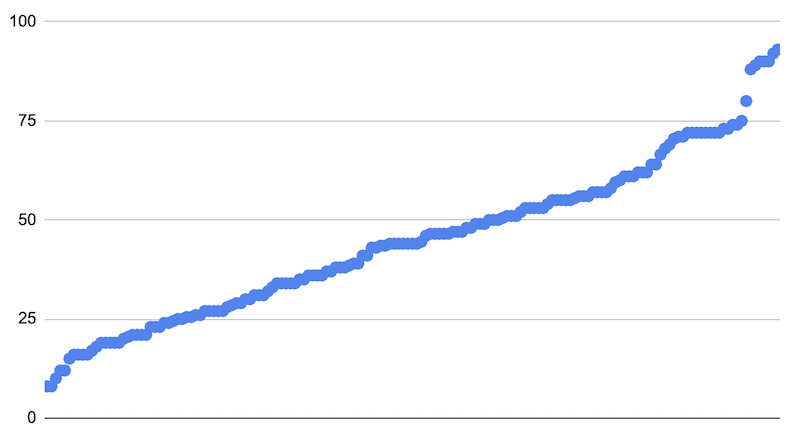
These are just tools; you need good creators, too. The following illustration shows that on Google Page Speed on mobile, a website can have a very poor score like 9/100 or go as high as 98/100. The common denominator: the same CMS, WordPress.
Drupal and WordPress can be used to create high-performance websites, while meeting all the criteria for a competitive, eco-friendly website.
Nevertheless, there are still pitfalls to avoid. With WordPress, you can use builders to help with your page layout, the most well-known being Elementor. But not all builders are equal: at Webvert we made a comparison of WordPress builders.
At Shopify, the engine automatically optimises images on article pages. However, if you use builders like GemPages or PageFly for a blog or collection, it’s a disaster (there are no other words to describe it!).
Similarly, no-code solutions such as Webflow or Squarespace are also very tolerant: we end up with sites that are very slow for our terminals to loads, which forces us to upgrade them.
Which tools can you use to measure a website’s performance?
Currently, there are different types of tools for measuring a website’s performance.
To measure a theme, we recommend the GreenIT EcoIndex. Please note that it is not necessarily suitable for analysing content. The CO2 equivalent and water indicators are for raising awareness, and they cannot be used in a study.
To analyse content, we recommend the following tools:
- Google Page Speed, which gives you an optimisation score for content and theme
- sites like Website Carbon Calculator, Ecograder and many more that all rely on the same open-source CO2.js library.
The limitation of these tools is that they only measure one page at a time.
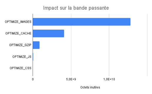
The other limitation is that they work on a total, whether that content is useful and visible to users or not. The approach we take at Webvert is to identify digital waste. This is the part of the bandwidth that leaves the servers and arrives on your phone, but is unusable – for example, an image that is 6000 x 4000 pixels but is displayed at 300 x 200 pixels. This mundane example already makes a difference of several megabytes, whereas currently, we are trying to bring the size of a webpage to around 1 MB.
What are the main actions you need to take to optimise a website?
To eliminate this digital waste and optimise your web pages with equal content and equal CMS, we have identified the following key actions:
- optimise server configuration (caching and text compression)
- choice of image formats
- image sizing
- image compression
- Optimising server configuration
At Webvert, we see far too many misconfigured websites.
There are two important settings for your website:
- Cache: the setting recommended by Google is one year, which prevents your visitors from having to reload the same images.
- Text compression: this setting is normally well-tuned on OVHcloud Web Cloud solutions, but occasionally, incorrect settings make the situation worse.
- Choosing an image format
If you are using Figma or Photoshop, click “Export ”, and the first format offered is PNG. Here is one of the main actions you can take when building your optimised website.
By always selection PNG, you end up with images 4 to 10 times bigger than if you had selected the right format.
Our advice on choosing the right format:
- logo : opt for SVG format, and in some cases PNG
- diagrams, illustrations in solid colours: PNG is the right format, but SVG may be more suitable
- photos or diagrams containing a photo: JPG format
Normally your website will contain 70-90% JPG images. You will notice that we didn’t mention the WebP format for websites – more on that later.
- Making your images the right size
The other classic mistake is to publish your images directly on your website without a second thought. Like going to a commercial printer, you need to adapt the content for a website and take the time to look at how your image is being displayed. You may need to resize it with your image viewer (e.g. Preview on iMac or Photos on Windows).
A comprehensive tutorial for resizing images is available on Webvert’s blog.
- Optimising images
For optimising a site, the two actions above allow the size of an image to be reduced by 2, 3, 4 or 10 times. It is also possible to optimise the size of the images by 10 to 30%. There are tools to help you do this.
A comprehensive tutorial on optimising images is available on Webvert’s blog.
- What about the code?
For website optimisation, we will not cover the topics of code, JavaScript, or CSS. Our analysis data shows that, more often than not, this factor makes up less than 4% of the impact in reducing the “useless” part of a website.
The data shows that you have to address the content of a website first, then tackle the code.
At Webvert, we only see a website that needs CSS and JavaScript optimisation in about one in a hundred cases.
How can I launch these actions all together?
At Webvert, we have developed an internal tool to process hundreds or even thousands of images per day using all the best practices. This is available on OVHcloud Marketplace.
Beware of the side effects of over-optimisation
When you submit your website content on Google Page Speed, when analysing certain images, we recommend using the WebP format. This was designed by Google to create high resolution images in smaller sizes, so you can use WebP format without second-guessing yourself.
Please note, however, that using only WebP format can also increase a website’s environmental impact. Many phones and tablets dating back to 2016 will not be able to display these images, and as a result, a lot of your content will be truncated.
However, by displaying only WebP images on your website, you will get very good optimisation scores, regardless of the tool. But you may force people to upgrade their devices – and as a reminder, manufacturing accounts for 60% to 70% of the impact of digital technology on our planet.
At Webvert, we won’t be using WebP until 2026: 10 years after this. We analysed the data in the field: an optimised and well-dimensioned JPG gives a very similar result to WebP.
Beyond websites, how can you minimise the impact of your product?
You now have a good idea of how to optimise your website’s content. If you want to go even further, think about the digital products your team designs and promotes. Often, development teams will focus on optimising server consumption.
The advice we can give you is to also consider external factors, known as Scope 3 emissions. Where does your product stand when it comes to your customers replacing their devices? In most cases, the decision is made to no longer support old devices used by only a small percentage of people. But by doing so, you are taking millions of electronic devices off the market and making the second-hand supply poorer.
We would like to share one last piece of advice for your website: test it on an old phone and in an area where the network is bad (usually this shouldn’t be hard to find!) and judge the user experience.
Find Webvert on the OVHcloud Marketplace and start decarbonizing your website

Youen Chéné
Co-founder of Webvert